Sunday, 13 March 2016

'Movement' - Exhibition at Centrespace, Bristol, UK.

 MOVEMENT


Title of show: Movement
Dates of show: 18th-22nd March 2016
Opening times: Sat 19th 11-8pm, Sun 20th 12-5pm, Mon 21-Tues 22nd 12-6pm
Private view date & time: Friday18th 5-9pm 
Artists exhibiting: Sally Coulden, Jiang Dai, Robyn Frances, Jonathan Hooper, Sofia Mesa Giner, Seema Schrenk, Jane Speedy, Kim Sullivan, Jo Williams. 

Description of show/press release:

'Movement' is an exhibition by the Post-Diverts Student Art Collective. We are a collaborative group of nine fine artists at Bristol School of Art that share diverse histories, cultures and senses of humour. 
'Movement' implies motion through space, the passing of time, as well as socio-political and cultural changes. The multi-media work emerged out of a shared interest in the possibilities of movement.


Friday, 11 March 2016

Ideas to Form VI - 'to be, or not to be. 'Experimentation' - painting on perspex


Red acrylic, green spray paint behind


The decision to paint on perspex has come from wanting to experiment with paint effects on different surfaces. The objective for me is playing with colour and light. By using the transparency of perspex I can play with layering the colours and also vary thickness of paint which allows light to permeate the colours in different intensities giving an amazingly spontaneous, interesting and sometimes quirky effect.


Its been huge fun experimenting and fundimentally playing with mark making. Varying sized brushes with different thickness of paint. Sgraffitto with the end of my brush, adding acyilic medium to thin the paint so I can do drips and dob paint on. Flicking white spirit onto the paint disperses the it leaving room to overpaint in a different colour making the imagery more dynamic. 

Im loving the spray paint and its effect on wet acrylic - crackling the surfaces  - the technique of effectively painting backwards on a surface is fab, the painted side of the perspex in theory is the back of the artwork if its to be hung on the wall - alternatively what I find interesting is being able to see the work from both sides, they are both standalone art works.


This work forms the basis of my research for the upcoming 'Movement' exhibition at Centrespace Gallery in Bristol. 
Time is running short so time to get on with the show piece!!!


Friday, 26 February 2016

Ideas to Form V - Impact of light


Printing onto acetate to experiment on the influence of changing light on the image.
Suspended across the front of the light-box set to transitional coloured lighting (fibre optic) I have made this short film to demonstrate the visual illusion and how colour can transform and change what we see. 


'present tense'
James Turrell
'a retrospective'
James Turrell 


Playing with light, colour and visual perception is fascinating, my inspiration comes from studying the light sculpture works of James Turrell, yes I love to set my sights and ambition high!!!!!  (see exhibitions). 


'the wolfsberg project'
James Turrell

His mastery of the scientific theory of how colour and intensity of light interacts with our rods and cones. The interplay between both plays with our powers of perception result - breathtaking. His ability to sculpt with light takes his work to such a high level of genius, Im in awe!.

What I need to decide is how good can I been at this lighting ? Is this something I want to pursue further - if I do it I need to do it well......


With an exhibition looming I need to concentrate on developing and exploring imagery - strip things back a bit, and not try to over complicate my work. Decision made that unless the lighting can be seamless and uber professional Im not going down that path at the moment but its most definitely something Im going to pick up later.

Thursday, 25 February 2016

Ideas to Form IV - Let there be light! .......the light box........

1 x wooden frame


1 x white box


4 x strips of fibre optic lighting


1 x electronic gizmo to intermittently transition colour

Ideas into Form III - Developing imagery

Lots more playing with images as well as inverting colour and saturation levels. A few examples how the imagery can transform by altering the colour hues, saturation. Im aiming for interesting transitions between the colors. Providing a a depth yet vibrancy to the overall effect.


Ideas to Form II


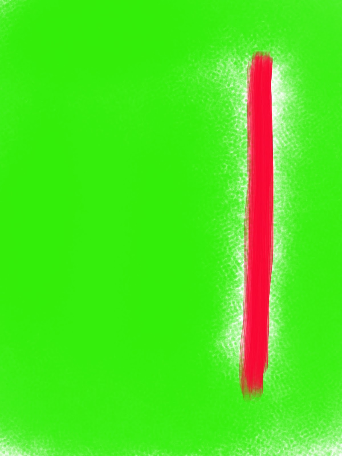
'red on green'
Using the iPad to play in the technological world of colour interaction. 
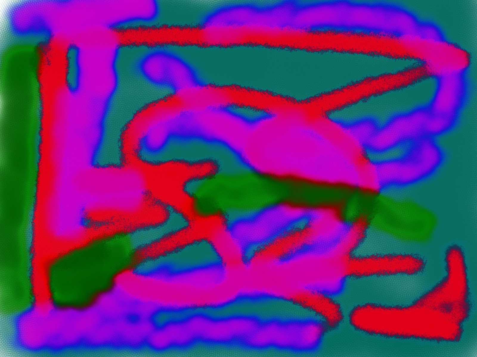
I guess this approach is not for the 'art purist' but using the app 'Brushes Redux' you can technologically alter the saturation, contrast and achieve some fantastic definition. 
I especially love when two colours crash into each other achieving that amazing tingle of contrast - for me Im after a 'zing' from my work. Im not interested in the flat and dull, I want my work to be of interest to the viewer, make them look harder at the piece and question themselves as to what it is they are interested by.
'why not?'
'overlay'

'Drums'
   
How to reproduce this luminosity is the question? My next idea takes me to working with acrylic perspex. Ive never attempted this before but what if I take a digital image and print it onto perspex - not only will I get the vivid luminosity Im after, (some purists would suggest 'artificially' created colour). but I can go big as well!

My thoughts on technology assisted art: I think its a great asset to be able to embrace and use technology to push boundaries and build on ideas. I believe it is still art, even if it is artificially created as some would argue. Pure technology or embrace both approaches to bounce and ignite off each other - for me, embracing technology is the way to really make sure Im not missing anything - its all about stretching the boundaries and imagination to progress thinking and ultimately your work. 

Take Chuck Elliott, International contemporary artist who starts with sketches and ideas, progresses to digital to create the imagery and colour - 'liquid geometry' then either digitally prints or manually prints.http://www.chuckelliott.com


Now my mind is on overdrive what if I then build on this colour sensation and add intermitant coloured fibre optic lighting ...... off to the workshop ..... this is soooo exciting!!!

'inversion'
'simplicity'


Thursday, 11 February 2016

Ideas into Form I

New term and time to get creative !  Having returned from New Zealand Im full of sunshine and bright colours so time to go fluro !

Have started to play with the colours and looking at complementary colours - am I looking for this or do I want loud??!!


Not sure where this is going at the moment but some test colours to get the imagination triggered - think this is going to be fun !